Pensam
Services
- Brand Identity
- Implementation
- Digital design
- Tone of Voice
- Signage
- Photoshoot
- Brand strategy
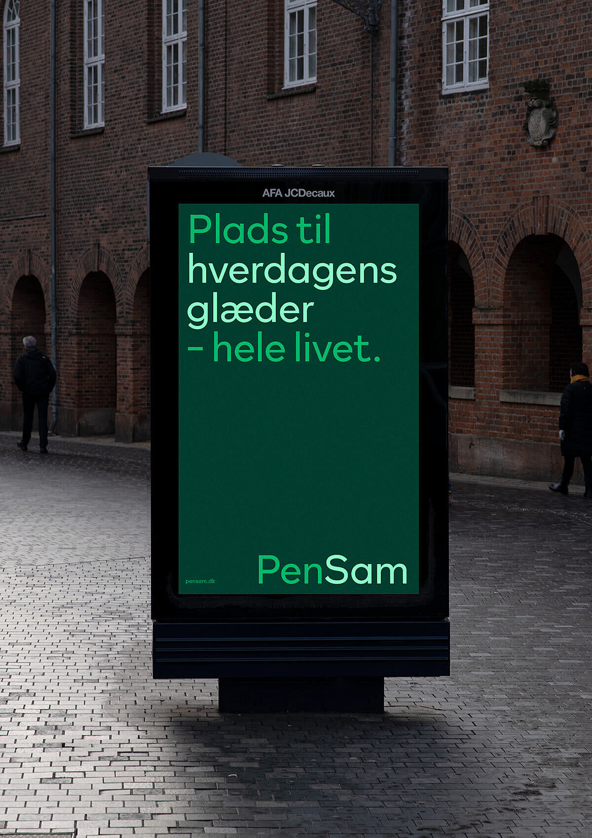
Dynamic and eye-catching, PenSam’s new brand identity now reflects the DNA and purpose of their organisation and ensures recognizability and high usability across all touchpoints.
PenSam is a labour market pension fund that manages pensions for people working with care and services in Danish municipalities, regions and private companies. PenSam also offers insurance and banking services.
Through interviews and workshops, we helped PenSam define their purpose and brand values as the foundation for designing a new brand identity showing the world who PenSam are and what they stand for.
PenSam handles an essential task for those who work every day to take care of others and ensure that society works. A group of people with low-income jobs that often feel overlooked by financial institutions.
The green colour is a bearing element in the design, symbolising balance and security. It creates a positive and comfortable universe that is uncomplicated to engage with.
The prominent icons make straightforward and clear communication a breeze. The images portray PenSam’s customers’ real lives to position PenSam as someone who truly know and understand their target audience and their joys, sorrows, concerns and needs.


